Case study · Personal product · 2026
VoiceOrb: tracking money and reminders by just speaking.
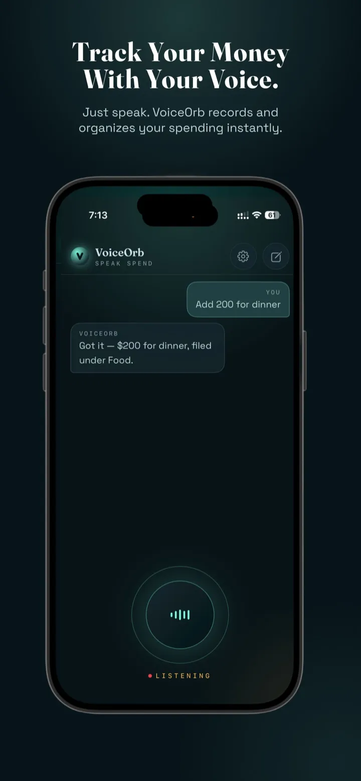
A voice-first assistant that turns one spoken sentence into a logged expense, a bill reminder or a saved note — designed and shipped end to end, from first prototype to App Store approval in under six weeks.
- My role
- Solo — product design, UX writing, prototyping & build
- Timeline
- Sep – Oct 2026 · ~6 weeks to launch
- Platforms
- iOS (native) · Web · Android (closed beta)
- Status
- Live on the App Store
The problem
Tracking is easy to start and easy to abandon.
Expense trackers and reminder apps ask for the same thing every time: open the app, find the right screen, pick a category, type an amount, choose a date. Each step is small, but together they add enough friction that most people stop after a week — usually right when the habit would have started paying off.
Meanwhile, the information is already in people's heads as a sentence: "spent 250 on lunch", "remind me to pay the electricity bill on Friday."
What if logging something took exactly as long as saying it?
Approach
Design in the real material.
Voice interfaces are hard to judge in static mockups — timing, mishearings and the wording of every reply only show up when you actually talk to the product. So instead of a spec-and-handoff process, I prototyped directly in code with Claude Code, testing each idea on my own phone daily and refining the experience from real use.
That let one person own the whole loop: interaction design, conversational UX writing, visual design, and the decisions that usually get lost between design and engineering.
01
Speak, don't fill forms
One sentence in. The app works out amount, category, date and type.
02
Ask only when it matters
Act immediately when the intent is clear; ask one short question when it isn't.
03
Never lose trust
Show exactly what was saved, keep the original data, and be upfront about AI.
Key design decisions
Six decisions that shaped the product
01 · Conversation in, structure out
Talk on one screen, see the result on another
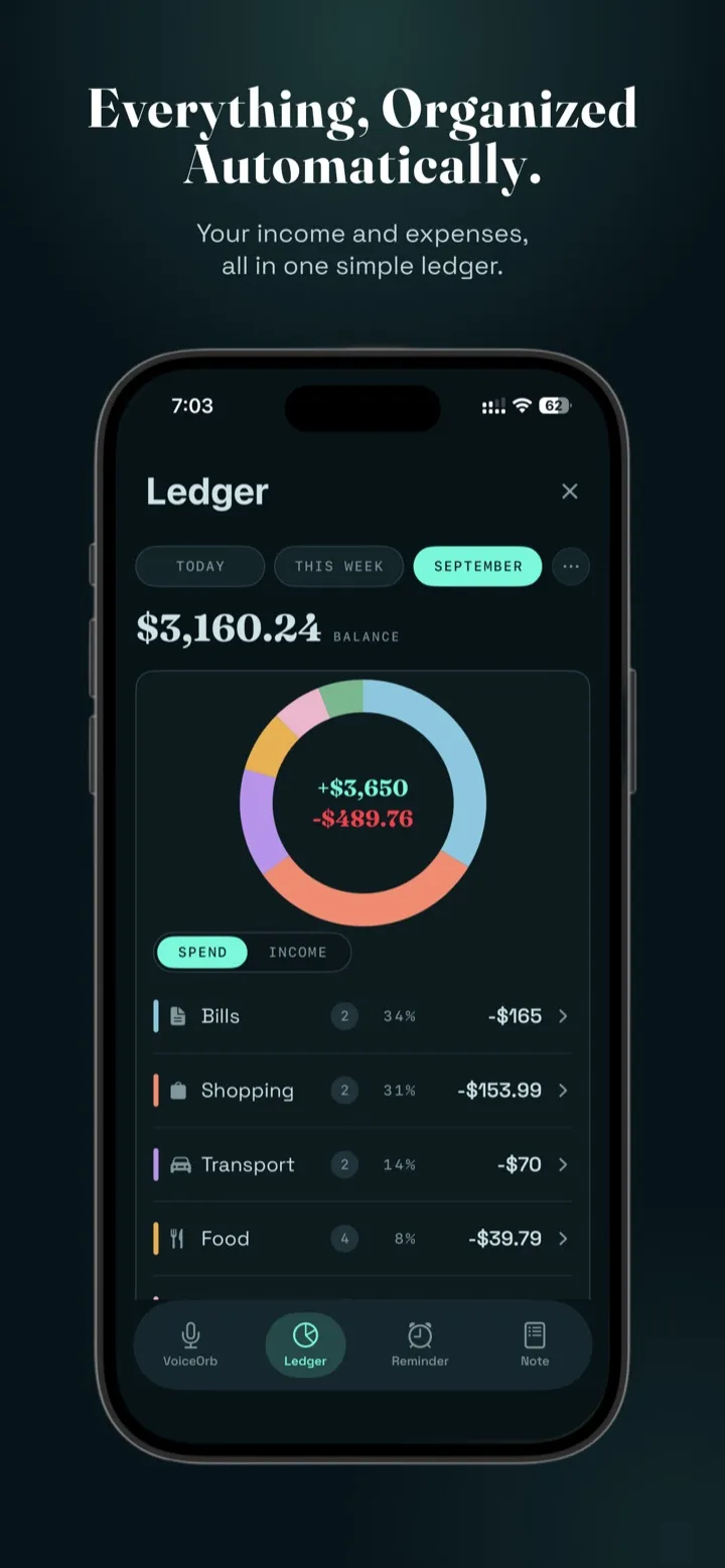
The home screen is a single microphone and a short conversation. Everything you say lands in a structured view — Ledger, Reminders or Notes. Early versions hid these views behind a "⋯" menu; people simply didn't find them. I replaced it with a persistent bottom tab bar so the payoff of speaking is always one tap away.
02 · Confirm, don't interrogate
Different confidence rules for different actions
A wrongly logged ₹200 lunch is easy to fix; a wrongly logged salary skews the whole month. So expenses are saved instantly with a one-line confirmation, while income gets a quick "should I add this?" first. Every reply repeats the exact amount, category and time back, so the user can verify without opening anything.
03 · Reminders that look like bills
Designed around what people actually remind themselves about
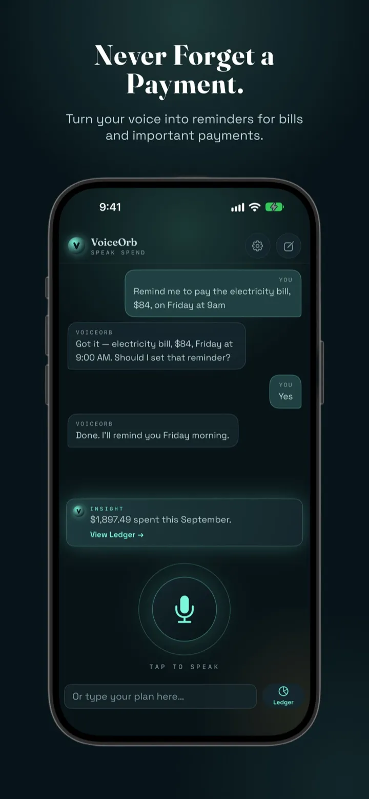
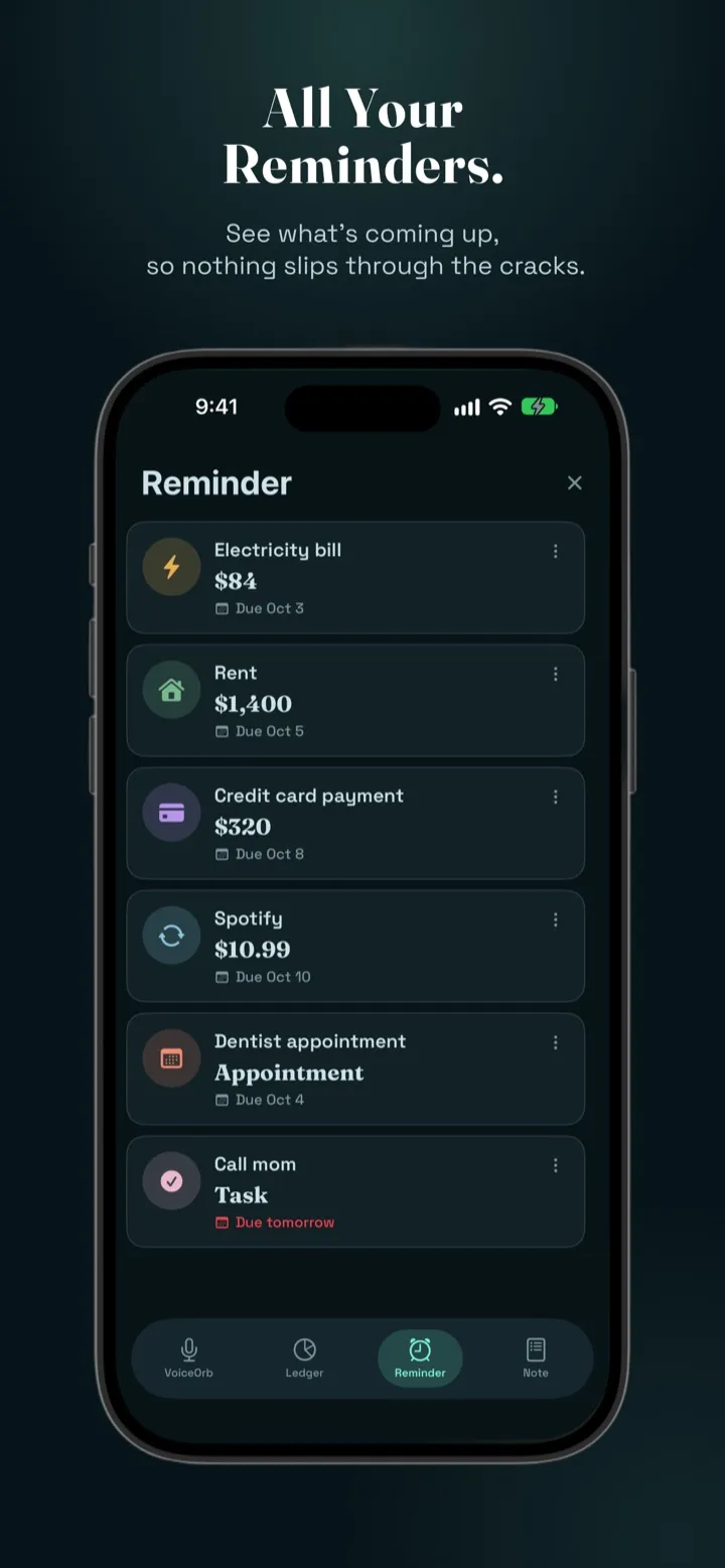
Most reminders turned out to be payments — rent, electricity, a credit card. A generic to-do row hid the most important detail, so I redesigned reminders as bill-style cards: category icon, amount front and centre, due date, and a quick edit menu. Early alerts are summarised in plain language ("plus 1 early alert").
04 · Spend in any currency
Convert for consistency, but never throw away the original
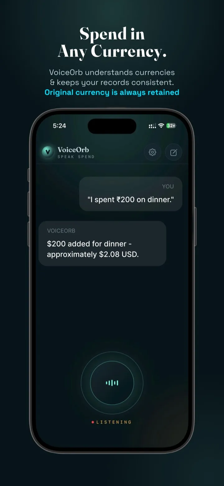
People travel and shop online in other currencies. If you say "I spent ₹200 on dinner" while your Default Currency is dollars, VoiceOrb converts using live exchange rates and keeps the original amount visible right beside it in the ledger. If a rate can't be fetched, it asks rather than guessing — a wrong number is worse than a short delay.
05 · Designing for mishearing
Speech recognition is never perfect, so the UI shouldn't pretend it is
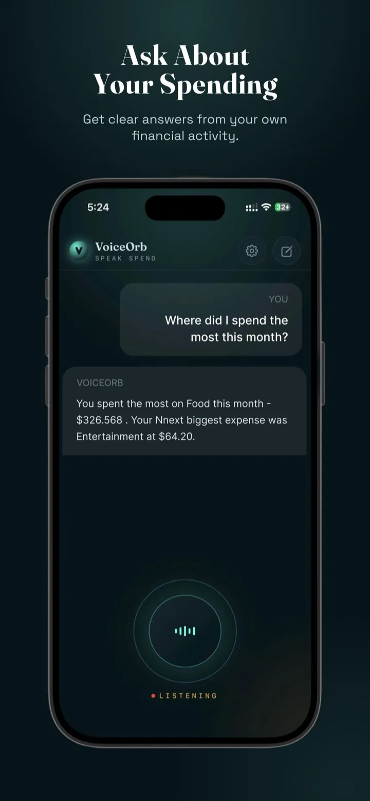
Testing by voice every day surfaced patterns no mockup would: spoken numbers transcribed as words, and "spent" regularly heard as "Spain". I added a normalisation layer so the conversation shows what the user meant ("Spent ₹250 lunch"), and kept a text input for noisy places or when speaking isn't appropriate.
06 · Trust and transparency with AI
Consent before the first word leaves the phone
VoiceOrb uses an AI model to understand what you say. Before anything is sent, a clear consent screen names the AI provider, explains what is shared and why, and can be revoked at any time in Settings — designed ahead of Apple's stricter rules for apps that share data with AI services. Every AI reply also has a "Report" option, so people can flag a wrong or inappropriate answer.
Shipping
From idea to the App Store in under six weeks.
Before submitting, I ran a full audit of the app the way a reviewer would. It caught a serious issue: sample data used during development was still wired to load on launch and would have replaced real users' entries. Removing it before release was the most important "design" decision of the launch — trust lost on day one doesn't come back.
I also scoped the first release to iPhone in portrait only, because that's the layout every screen had been designed and tested for, rather than shipping untested iPad and landscape views.
weeks
First prototype to App Store approval
platforms
Native iOS, web app, Android in closed testing
tools in one
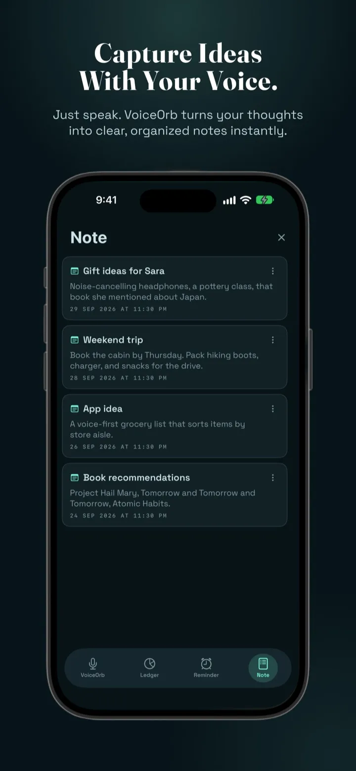
Ledger, reminders and notes from a single input
sentence
Everything it takes to log an expense
The product
What I learned
Voice design is writing design.
With no buttons to lean on, the wording of each reply is the interface. Short, specific confirmations built more trust than any visual polish.
Prototype in the real medium.
Building in code instead of static frames exposed timing, mishearing and edge cases weeks earlier than a traditional handoff would have.
Trust is a feature you design.
Consent, keeping original data and asking instead of guessing don't show up in screenshots, but they're why people keep using the product.